Study 0001 Decided Full record
Blog rethink
Why d34dman.com feels cramped, scattered and anonymous, and what a rebuild should fix first.
This is the full record behind the study: every question, every option and every answer. For the story of how it was decided, read the essay.
Context and problem
d34dman.com is Shibin's personal technical blog: 23 published posts on Drupal, FlowDrop, Atelier, engineering and project management, plus two interactive Svelte apps (an EVM simulator and an S-curve chart). It is built with Hugo, Tailwind and DaisyUI, packed into an nginx Docker image on GitHub Actions, and served from Shibin's Hostinger VPS behind Traefik.
The complaints fall into two groups. Reading: the article column is too narrow for code, the pages don't share one visual language, the site says little about who Shibin is today, and on a post page the eye goes to the sidebar and the support box before the text. A browser audit adds three bugs: on phones every post is wider than the screen, the brand font never loads, and dark mode doesn't switch on. Running it: Svelte apps and Markdown posts are built by two separate toolchains glued together by hand, SEO basics are missing, and there is nothing on the site that an AI agent (or a reader with a keyboard) can drive.
The question for this study is what the blog is for, which of these problems matter most, and whether to refactor the Hugo site, move to another stack, or rebuild around Sutram so the blog doubles as its showcase.
1. Too narrow for a technical blog
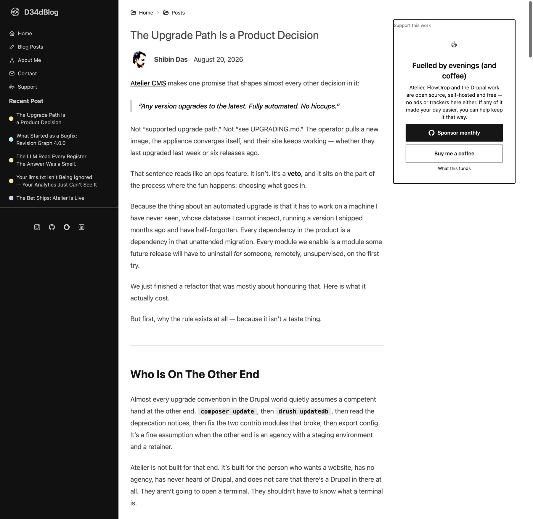
The post layout is a 3-column grid inside a max-w-7xl container, next to a 320 px sidebar that is always open on desktop. The article takes 2 of the 3 columns, and Tailwind Typography's prose class caps it at about 65 characters.
- 65ch is right for paragraphs, wrong for code, tables, diagrams and the Svelte apps, which all inherit the same cap.
- Nothing can break out of the column: no wide code blocks, no full-width figures.
- On mobile the cap is fine; the problem is desktop only.
The fix is usually not a wider paragraph, but a layout where text stays readable and code and figures may go wider.
2. No consistent design
What we saw on the home page and a post page:
- Two type voices. Card and featured titles are heavy and large (48 px, black); the post title is light (30 px, thin). They look like different sites.
- Category colours carry no meaning. Engineering is yellow, Drupal cyan, Musing lavender, FlowDrop pink. Pastels on heavy black borders, unrelated to the rest.
- Three box styles. Brutalist 4 px black cards, a gradient featured hero, and DaisyUI's thin wireframe theme on buttons and pagination.
- The same list twice. "Recent Post" sits in the sidebar and as the home page grid.
- The featured post is stale. The home hero picks the first post tagged
feature, which is from March, while newer posts sit below it. - Cards are titles only. No summary, no reading time, no image, so every card weighs the same.
The theme is DaisyUI's wireframe preset with overrides. There are no design tokens of our own, so every partial makes its own choices.
3. Doesn't represent the author
The site is called D34dBlog, not Shibin Das. What it says about the author:
- Author box under every post: "Drupal Developer. Spice Dealer. Prying on Information Architecture nowadays." Links to GitHub and Instagram only.
- About page (written 2024): career story from embedded engineering to Drupal PM and freelancing, ending at Factorial.
What it does not say: tech lead at Factorial, creator of FlowDrop, Atelier CMS and Sutram, maintainer of Revision Graph, conference speaker (DrupalCon Rotterdam 2026, the talks record on drupal.org), drupal.org profile. Those projects appear only as post categories. A visitor coming from a talk or a GitHub repo cannot see that body of work in one place.
4. Readers can't focus on what's important
On a post page there are four things competing above the fold: the dark sidebar with nav and recent posts, the breadcrumb, the article, and the support box. The support box has the heaviest border on the page, so it wins.
- No table of contents on long posts (a
tocshortcode exists but has to be added by hand). - No reading time, no series navigation even though posts have
seriesfrontmatter. - The category label and tags sit at the very end of the post.
- The home page gives every post equal weight, so there is no "start here" for a new reader.
5. UI audit: what the browser measured
We loaded eight pages (home, post list, a tag page, three posts, the EVM app, about) in a scripted browser at 1440 px, 390 px and in dark mode, and read the computed styles. The numbers below come from that run on 23 Oct 2026, not from the source.
6. Typography
- The brand font never loads. Hind Madurai is preloaded, but the
fontFamilysetting sits inside the DaisyUI theme object, where Tailwind ignores it. Every page renders in the system font: SF on a Mac, Segoe on Windows, Roboto on Android. The site looks different on every reader's machine, and the preload is wasted bandwidth. - Hierarchy is inverted on posts. The title (H1) is 30 px regular; every section heading (H2) is 30 px bold, so the first H2 looks more important than the title.
- No H1 at all on
/posts/and tag pages (they start at H2). Two H1s on the EVM simulator page. - Small, crowded lists. 14 px is the most common size on the home page; dates and labels are all the same 14 px with no weight or colour step between them.
- Paragraphs themselves are good: 18 px on 32 px line height.
7. Colour, borders and shape
One post page uses this many distinct values:
| Property | Values found | What a system would use |
|---|---|---|
| Border widths | 1 px (dividers), 2 px (support box), 4 px (cards) | 1, maybe 2 |
| Corner radius | 2 px, 4 px, 6 px, fully round, top-only 2 px | 1–2 |
| Text colours | near-black, near-black at 80%, pure black, grey, white, plus Monokai code colours | 3 (primary, secondary, accent) |
| Category fills | yellow, cyan, lavender, pink, light blue, lime | 0–1 accent; category as a word |
| Code theme | Monokai (dark olive #272822) on an otherwise white, greyscale page | one that follows the page theme |
The base is a clean monochrome (DaisyUI wireframe). The pastels and heavy black borders were layered on per partial, which is why the home page and post page look like two sites.
8. Mobile: text is cut off
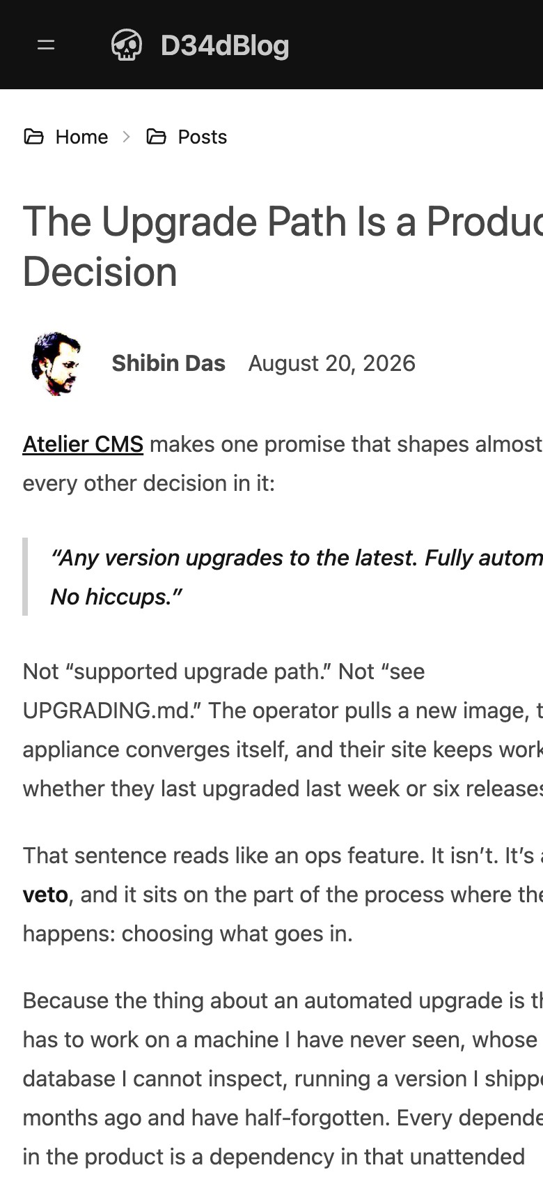
- Every post overflows on phones. The page measures 449 px on a 390 px screen. The post grid's single column grows to fit the widest code line (
grid-cols-1withoutmin-w-0), so paragraphs, the title and the byline are wider than the screen. Readers have to scroll sideways on every line. The home page overflows the same way. - Below 1024 px the sidebar becomes a top bar, which works. The support box and recent posts move under the article.
- This is the most urgent UI bug: most link traffic from LinkedIn and chat opens on phones.
9. Dark mode, accessibility and weight
- Dark mode doesn't work. The config asks for DaisyUI's
nighttheme as dark, but registers the dark theme under the namedark. With the OS set to dark, the page stays white. - No skip link past the sidebar's 10+ links for keyboard and screen-reader users.
- Contrast is fine: body text is near-black at 80% on white, the sidebar is light grey on near-black.
- All images have alt text.
- Pages are light. 133–143 KB and 5–6 requests for home and posts, no third-party trackers (Umami is self-hosted). The EVM app page is 209 KB. One maths post (EVM, with KaTeX) is 1.36 MB, ten times a normal post.
Worth keeping in any rebuild: the light pages, the 18/32 paragraph rhythm, the monochrome base, the byline with avatar and date, and no tracking.
10. How it is built today
Hugo itself is fast and the posts are plain Markdown, which is worth keeping. The pain sits in the joins: Svelte 3 (two majors behind) compiled by a separate toolchain, a CSS step that races Hugo when run in parallel, and a Cloudflare Worker setup (wrangler.jsonc, build:cf) that is no longer used.
Where it really runs. Every push to main builds ghcr.io/d34dman/d34dblog:main (Hugo build, then nginx 1.25). A small server runs that container. Analytics is the self-hosted Umami. The repo's AGENTS.md still calls Cloudflare primary and Docker legacy, so an agent working on the blog today starts from the wrong picture.
11. SEO findings
Checked on the home page and /posts/engineering/upgrade-path-is-a-product-decision/:
- No Open Graph or Twitter card tags. Links shared on LinkedIn, Mattermost or Slack show no title card or image.
- No structured data. No JSON-LD for
Article,PersonorBlogPosting, so search engines don't connect posts to the author. - Duplicate head tags.
head.htmlandbaseof.htmlboth print the meta description and viewport. Pages without adescriptionget an empty one. - Thin sitemap. 96 URLs, of which 51 are tag pages and 8 category pages, against about 25 posts.
- robots.txt has no Sitemap line.
- Two hosts.
d34dman.comanswers 200 instead of redirecting towww: the Traefik router serves both hosts (the canonical tag softens this). - No
llms.txt(404), on a blog that has a post about llms.txt. - Site title "D34dBlog" in every
<title>, so search results never show the author's name.
12. No agentic helper, and the Sutram idea
Today a reader or an AI agent can only click and scroll. Sutram, Shibin's own package, turns what a web app can do into commands: people type them into a console, agents call them as WebMCP tools in the reader's own browser session.
On a blog that could mean commands such as search drupal, open series flowdrop, toc, cite, evm simulate --bac 100000. The blog becomes a working showcase for Sutram, and agents reading the site get structured tools instead of scraping HTML. The open question is how far to go: a console on an otherwise static site, or a site built around it.
In scope
- Reading experience on desktop and mobile: layout, typography, focus
- One visual language across home, list, post, about and app pages
- UI bugs found in the audit: mobile overflow, font loading, dark mode, heading order
- How the author and his projects are presented
- Build and authoring setup: Hugo, Svelte apps, Docker image and deploy to the VPS
- SEO and machine readability (OG, JSON-LD, sitemap, llms.txt)
- An agentic or command layer, possibly Sutram
- Studies as a recurring content type: multi-column sections, figures, decision logs
Out of scope
- Rewriting existing posts (only frontmatter and shortcodes may change)
- New domain, or moving off the Hostinger VPS, unless the stack choice forces it
- Comments, newsletter and analytics product choice
- Project sites of their own (FlowDrop, Atelier, Sutram docs)
Assumptions
- Most readers are developers and tech leads reading on desktop, arriving from LinkedIn, drupal.org, GitHub or talks.
- Posts stay in Markdown with frontmatter, in this repo.
- The two interactive apps (EVM simulator, S-curve) must keep working, but don't need to stay Svelte.
- Hosting stays on the current server; the unused Cloudflare Worker setup can be removed.
- This is a one-person project done in evenings, so whatever we pick must be cheap to keep alive.
- URLs of existing posts must not change, or must redirect.
Glossary (9 terms)
- Hugo
- A static site generator written in Go. Turns Markdown into HTML at build time. What the blog uses today.
- Svelte
- A JavaScript UI framework. Used here only for the two interactive apps, compiled separately and embedded into posts.
- prose / 65ch
- Tailwind Typography's article styling, which caps line length at about 65 characters for comfortable reading.
- Open Graph (OG)
- Meta tags that decide the title, description and image a link preview shows on social sites and chat tools.
- JSON-LD
- Structured data in a script tag that tells search engines "this is an article, by this person, published on this date".
- llms.txt
- A plain-text index at the site root that tells language models what the site contains and where to find it.
- WebMCP
- A browser proposal that lets a web page hand tools (functions) to an AI agent running in the user's browser.
- Sutram
- Shibin's open-source package: one command registry for a web app, exposed to people as a console and to agents as WebMCP tools.
- Dogfooding
- Using your own product in your own work, so you find its problems first.
Decision drivers
What the direction had to satisfy. Each one was decided first; the details are below.
- U-02 What is the site first? An author home with a journal
- D-01 What should a post page look like? One grid, three widths
- D-02 Which visual identity should the site have? A small identity of its own
- D-03 How should interactive pieces live in posts? Components inside posts
- D-04 How open are we on the stack? Open to a JS static generator
- D-05 How far should the agentic helper go? Plus a Sutram console and WebMCP tools
- D-06 Fix the bugs now, or only in the rebuild? Only in the rebuild
- D-07 How should studies be published on the blog? A study content type, rendered from the study file
Decisions
U-01
Does this capture the problem?
Everything after this builds on the seven findings above. If something is missing, wrong or overstated, say so in the note, and we fix this tab before moving on.
Decided Yes, this matches my understanding
Decided by Shibin Das, .
U-02
What is the site first?
Three of the four reading complaints (width, focus, representing the author) are solved differently depending on the answer. A journal puts the article first; an author home puts the person and the work first.
-
Decided Recommended
An author home with a journal
The home page says who Shibin is and shows the work (FlowDrop, Atelier, Sutram, Revision Graph, talks), then the latest writing. Post pages are pure reading.
Pros
- Answers "who is this" for visitors from talks and GitHub
- Projects get a permanent place, posts link into them
- Gives a natural home for a Sutram console
Cons
- More pages to design and keep current
- Risk of a portfolio that goes stale between projects
The other 2 options
-
A technical journal
The posts are the product. The home page is a reading list; the author shows up in a byline and an about page.
Pros
- Simplest to build and keep alive
- Matches how most readers arrive: on one post, from a link
Cons
- Doesn't fix "doesn't represent the author"
- Projects stay scattered across categories
-
A project hub
The site is the umbrella for FlowDrop, Atelier and Sutram. Posts are grouped under the project they belong to; general musings are secondary.
Pros
- Strongest story for the open-source work
- Clear navigation by project
Cons
- Each project already has, or will have, its own site
- Musings and PM posts have no natural place
Recommendation An author home with a journal, because it is the only option that fixes "doesn't represent the author" without giving up a reading-first post page. The project pages can stay small: one paragraph and links to each project's own site and its posts.
Decided An author home with a journal
Decided by Shibin Das, .
D-01
What should a post page look like?
Fixes complaints 1 and 4 (too narrow, no focus) and the mobile bug. Studies like this one need side-by-side columns and large figures inside a post, so the layout must allow more than one width. It also decides how much of the theme survives, which feeds D-04.
-
Decided Recommended
One grid, three widths
No sidebar on posts. Every post sits on one grid with three named widths: text (~70 characters, for prose), wide (~1100 px, for code, tables, a 2–3 column comparison or an app) and full (edge to edge, for a large figure or diagram). A sticky contents list sits in the left margin on wide screens. Support moves to the end of the post.
This is what a study needs: prose in the text column, option cards side by side in the wide band, diagrams wide or full.
Pros
- Text stays readable, code and comparisons get room
- Columns and figures are part of the layout, not hacks inside a narrow column
- One thing to look at: the post
- The same grid collapses cleanly to one column on phones
Cons
- Authors need a way to say "this block is wide" in Markdown (a class, shortcode or component)
- The sidebar's recent posts move to the end of the post
The other 2 options
-
One wide column
Drop the sidebar and support column, make the article ~860 px. Text and code share the width.
Pros
- Simplest change
- Code fits without breakouts
Cons
- Lines of ~100 characters are tiring to read
- Figures and apps still capped
- A 3-column comparison doesn't fit, so studies need their own page layout
-
Keep three columns, slimmed
Collapse the sidebar to icons, shrink the support box, widen the article a little.
Pros
- Smallest visual change
- Keeps navigation always visible
Cons
- Still three things competing
- Article gains maybe 150 px, code still squeezed
- A 3-column comparison doesn't fit, so studies need their own page layout
Recommendation One grid with three widths, because it fixes width and focus at once and is the only option where a study's 3-column comparisons and large diagrams fit without a separate page.
Decided One grid, three widths
Decided in chat.
Decided by Shibin Das, .
D-02
Which visual identity should the site have?
Fixes complaint 2 (no consistent design). Whatever we pick becomes a small set of tokens (type, colour, spacing, borders) that every page, the code theme and the apps follow.
-
Decided Recommended
A small identity of its own
Monochrome base, one accent colour, one sans and one mono font that actually load, a light and a dark theme. The skull mark stays. Categories are words, not pastel fills.
Pros
- Represents Shibin, not a product
- Keeps what works today (monochrome, light pages)
- Small enough to maintain alone
Cons
- Needs a short design pass up front
The other 2 options
-
Borrow Sutram's look
Use the Sutram site's type, indigo accent and terminal blocks across the blog.
Pros
- Ready-made, already polished
- Ties the blog to the Sutram showcase
Cons
- The blog then looks like a product page
- FlowDrop, Atelier and musings don't fit an indigo dev-tool brand
-
Keep DaisyUI wireframe, just make it consistent
Fix the font, pick one border and radius, drop the pastels, keep everything else.
Pros
- Least work
- No new design decisions
Cons
- Still looks like a theme, not a person
- DaisyUI ties the design to Tailwind and its upgrade cycle
Recommendation A small identity of its own, because "doesn't represent the author" is a complaint and a borrowed product look makes it worse. Sutram can still show up as the console style.
Decided A small identity of its own
Decided in chat.
Decided by Shibin Das, .
D-03
How should interactive pieces live in posts?
Today the EVM simulator and S-curve are Svelte apps compiled by a separate toolchain and committed by hand. This answer decides whether the next stack must support components inside Markdown.
Studies add more of these: option cards, pros and cons, diagrams, decision tables. They are components too.
-
Decided Recommended
Components inside posts
Write
<EvmSimulator bac={100000} />in the post (MDX-style). One build compiles posts and components together.Pros
- One toolchain, nothing committed by hand
- Encourages more interactive posts, a strength of this blog
- Study building blocks (option card, comparison, decision log) become reusable components
Cons
- Rules out plain Hugo without a JS step
- Posts become MDX, not pure Markdown
The other 2 options
-
Apps on their own pages
Posts stay pure Markdown and link or embed (iframe) apps that live in their own folder with their own build.
Pros
- Posts stay portable Markdown
- Any stack works
Cons
- Two builds remain
- Iframes don't share theme or size well
-
Web components, no framework
Rewrite the two apps as small custom elements (
<evm-simulator>) that work in any Markdown.Pros
- Works with Hugo or anything else
- No framework to upgrade
Cons
- Rewrite of both apps
- More code for charts and forms
Recommendation Components inside posts, because the interactive posts are what sets this blog apart and the hand-made handoff is the current maintenance pain.
Decided Components inside posts
Decided in chat.
Decided by Shibin Das, .
D-04
How open are we on the stack?
Sets the boundary for the solutions in the next phase. Hugo is fast and fine for Markdown; the pain is the joins around it.
-
Decided Recommended
Open to a JS static generator
Astro, Eleventy or SvelteKit static. Still static files in the same Docker/nginx image on the VPS.
Pros
- One toolchain for posts, styles and components
- Existing Svelte apps can be reused
- Same hosting
Cons
- Migration of 39 posts and 13 shortcodes
- npm dependency churn
The other 2 options
-
Keep Hugo
New theme on Hugo, fix the bugs, keep Go templates and shortcodes.
Pros
- No migration, fastest builds, single binary
- All URLs and shortcodes stay
Cons
- Go templates are awkward to design in
- Interactive components stay a separate build (conflicts with D-03 inline)
-
Also consider Atelier CMS
Dogfood Shibin's own CMS (Drupal-based) for the blog.
Pros
- Second dogfooding story next to Sutram
- Editing in a browser, no git needed
Cons
- A database and PHP to run and upgrade for a personal blog
- Posts leave git
Recommendation Open to a JS static generator, because D-03's inline components need one toolchain and the hosting stays the same. Atelier is a strong story but a heavy one to operate for a one-person blog.
Decided Open to a JS static generator
Decided in chat.
Decided by Shibin Das, .
D-05
How far should the agentic helper go?
Decides what "eat our own dogfood" means here. Each level builds on the one before.
-
Decided Recommended
Plus a Sutram console and WebMCP tools
Everything above, plus commands like
search,open,series,toc,cite,evm simulate. People type them; agents in the browser call them.Pros
- Real dogfooding of Sutram on a public site
- No server or LLM cost: runs in the reader's browser
- Good material for a post and a talk
Cons
- A console on a blog must stay optional and out of the way
- WebMCP support in browsers is still early
The other 2 options
-
Machine-readable only
llms.txt, JSON-LD, a Markdown copy of every post, a clean sitemap.Pros
- Cheap, helps SEO too
- Agents read the site well
Cons
- Nothing to show for Sutram
- Readers see no difference
-
Plus an AI assistant that answers
A chat that answers questions from the posts, via an LLM the site would host.
Pros
- Most visible feature
Cons
- Running cost and abuse to manage
- Answers can be wrong in the author's name
Recommendation Machine-readable plus a Sutram console, because it is the dogfooding you asked for without a running LLM bill. A chat can come later on top of the same commands.
Decided Plus a Sutram console and WebMCP tools
Decided in chat.
Decided by Shibin Das, .
D-06
Fix the bugs now, or only in the rebuild?
The mobile overflow, the missing font, dark mode and the SEO tags are each small fixes on the current site. The rebuild will take several weeks of evenings.
-
Decided
Only in the rebuild
All effort goes into the new site.
Pros
- No throwaway work
Cons
- Phone readers keep a broken page for weeks
- No SEO gains until launch
The other option
-
Recommended
Quick fixes now, then rebuild
One evening:
min-w-0on the post grid, movefontFamilyinto the Tailwind theme, fix the dark theme name, add OG tags and JSON-LD, remove the duplicate head tags, add the Sitemap line.Pros
- Phone readers stop losing text this week
- SEO starts recovering while the rebuild happens
Cons
- An evening spent on code that will be replaced
Recommendation Quick fixes now, because the mobile bug clips every post for most link traffic and the fixes are a few lines each.
Decided Only in the rebuild
Decided in chat. Differs from the recommendation: mobile overflow stays until the rebuild launches.
Decided by Shibin Das, .
D-07
How should studies be published on the blog?
Studies like this one will become a recurring content type. This decides whether they need their own layout and data format, which affects the stack (D-04) and the components (D-03).
-
Decided Recommended
A study content type, rendered from the study file
The study's JSON (or Markdown with frontmatter) goes into the blog repo. A
studylayout renders it read-only: problem, diagrams, options side by side, the decisions with who made them, prior art, and the outcome. The live, interactive version stays on claude.ai while people answer; the blog publishes the result.Pros
- One source, two outputs: work in the study page, publish to the blog
- Consistent look for every study
- Decisions and prior art are structured, so they are good for search and agents (JSON-LD, Sutram commands like
study decisions)
Cons
- A second content model to maintain next to posts
- Collaborator names need consent before they appear publicly
The other 2 options
-
Write each study up as a normal post
After a study is done, write it as a long post using the wide grid and components.
Pros
- No new content type
- Full editorial freedom
Cons
- Rewriting what the study page already says
- Each study looks a bit different
-
Link or embed the live artifact
A short post introduces the study and links to (or iframes) the claude.ai page.
Pros
- Least work
- Readers see it interactive
Cons
- Content lives outside the blog: no SEO, no control
- Access depends on claude.ai sharing
Recommendation A study content type rendered from the study file, because the structure already exists in the study JSON and publishing it again by hand will not happen often enough to stay consistent.
Decided A study content type, rendered from the study file
Decided in chat.
Decided by Shibin Das, .
Prior art
What others did, and what we took from it.
-
Blog layout
Layout breakouts with CSS Grid (Ryan Mulligan)
One grid with named line pairs (
content,popout,feature,full). A child picks its width withgrid-column, no negative margins. Background: Rachel Andrew's explainer.Takeaway Exactly D-01's three widths: map text, wide and full to named lines with clamp() tracks; no media queries needed.
-
Blog layout
How I built my blog (Josh W. Comeau)
Next.js, MDX, Shiki for code, Sandpack for live examples. Components are written directly in posts.
Takeaway Interactive pieces belong in the post's own toolchain (D-03), not in prebuilt bundles.
-
Author home
Maggie Appleton
The home page says who she is and what she makes, then typed sections (essays, notes, patterns), each with a one-line definition.
Takeaway Show Studies as a typed section next to Journal and Projects, with a one-line definition of what a study is.
-
Author home
Simon Willison's weblog
A reverse-chronological stream of entries, links and notes; the person sits behind an About link.
Takeaway The counter-model to U-02. Worth borrowing: short typed notes keep a journal alive between long posts.
-
Stack
Astro
Static site generator with schema-checked content collections, MDX, islands for Svelte and other frameworks, first-party sitemap and RSS. Reported current: v7 (release details unverified).
Takeaway One toolchain covers posts, studies as JSON collections, Svelte components inside MDX, sitemap and RSS.
-
Stack
Migrating from Hugo to Astro (Astro docs, Chen Hui Jing)
Markdown and front matter carry over; Hugo shortcodes become MDX components. The write-up found pages and custom RSS took longer than components. Official guide.
Takeaway For 39 posts the work is the 13 shortcodes, keeping URLs (or nginx redirects) and feeds, not the content.
-
Stack
Eleventy 3
Simple, fast JS static generator; WebC for components. Stable 3.1.x, v4 in alpha. A 2026 rebrand ("Build Awesome") under Font Awesome leaves its direction unclear.
Takeaway Simple and fast, but interactive Svelte components would need a second toolchain again.
-
Stack
SvelteKit adapter-static
Prerenders a SvelteKit app to static files. Markdown posts need mdsvex, a separate project.
Takeaway Natural for the Svelte apps, but we would build the content layer (collections, schema, RSS, sitemap) ourselves.
-
Agent
llms.txt
A Markdown index at
/llms.txt, plus clean.mdcopies of pages linked withrel="alternate" type="text/markdown".Takeaway Generate llms.txt, llms-full.txt and a .md next to every post and study; add JSON-LD BlogPosting and Person.
-
Agent
Sutram's own site and docs script
Our own prior art. The live demo registers commands;
scripts/docs.mjsalready publishes docs as .html + .md and writes llms.txt and llms-full.txt. A static site adds Sutram with one module import,Sutram.register()andSutram.mountConsole(); loading it also exposes the commands as WebMCP tools. Package is at 0.6, contract may change before 1.0.Takeaway The reference build: reuse its docs script and console setup instead of inventing them for the blog.
-
Agent
WebMCP proposal
Draft spec for pages to hand tools to in-browser agents (
document.modelContext.registerTool()). The API was already renamed once; Chrome and Edge run trials, Firefox and Safari have not committed (trial details unverified).Takeaway Go through Sutram, not the raw API: Sutram's console and Sutram.call() work even where WebMCP doesn't.
-
Agent
Personal blogs exposing WebMCP tools
Two personal sites register small tool sets: search posts, list posts, read a post as Markdown, author context, talks. See also this AWS Builder write-up.
Takeaway Keep the command set small and stable: posts search, post read, study read, about. The console doubles as a ⌘K palette for people.
-
Decision records
MADR 4 (Markdown Architectural Decision Records)
A template: problem statement, decision drivers, considered options with pros and cons, outcome and consequences.
Takeaway Shape the study schema on these sections, so published studies read like, and stay compatible with, ADRs.
-
Decision records
Oxide RFDs
Numbered design documents with authors, state (ideation, discussion, published, committed, abandoned) and a public rendered site with an index.
Takeaway Number each study, give it a state, and publish an index page plus a JSON index next to it.
Considered options
The plan, the milestones and the clarifying questions in the next phase all follow from this.
-
Chosen Recommended
Astro + content collections + breakout grid + Sutram
Posts move to MDX in a schema-checked collection; studies become a JSON collection rendered by one study layout (MADR-shaped). The two Svelte apps become Svelte 5 components placed in posts. The three-width grid lives in one layout; DaisyUI goes, replaced by a small set of CSS tokens. The build writes .md copies, llms.txt, JSON-LD, RSS and sitemap; Sutram registers about five read-only commands. Output still ships in the same nginx image.Pros
- One toolchain for posts, studies and components
- Studies get a schema and one layout
- Svelte apps reused, IIFE handoff gone
- Hosting unchanged
Cons
- Shortcode conversion and URL redirects
- Svelte 3 → 5 upgrade of the two apps
- Astro major versions move fast
The other 2 options
-
Eleventy 3 + WebC components
Markdown stays almost as it is; studies are data files with a template; same grid, tokens, llms.txt and Sutram as Astro. Interactive pieces become WebC or plain web components, so the Svelte apps are either rewritten or keep their own build. The project's 2026 rebrand adds uncertainty.Pros
- Least content change
- Very small runtime
Cons
- Svelte apps rewritten or kept on a second build
- Project direction unclear after 2026 rebrand
-
Hugo kept, new theme
A new Hugo theme with the breakout grid and tokens; studies as Hugo data files; output formats for .md copies and llms.txt; Sutram in a script tag. Components keep a separate Vite build, which contradicts D-03 (components inside posts, one toolchain) and D-04 (open to a JS generator, chosen over keeping Hugo).Pros
- Fastest to ship
- No migration
Cons
- Two toolchains stay
- Goes against two recorded decisions
Astro + content collections + breakout grid + Sutram
Hugo kept, new theme
Recommendation Astro, because it is the only option where posts, studies and Svelte components share one schema-checked toolchain, which is what D-03 and D-07 ask for. Sutram and llms.txt cost the same on any stack, so the component story decides it.
Decision outcome
Chosen · E-01 Astro + content collections + breakout grid + Sutram
d34dman.com becomes an author home with a journal (U-02), rebuilt on Astro (E-01) as a new app at apps/astro (C-08), with a three-width reading grid (D-01), its own visual identity (D-02), components inside posts (D-03) and studies as a content type (D-07). A machine-readable layer and a visible, themed Sutram console make it the Sutram showcase (D-05, C-07). Hosting stays on the VPS; the new theme launches before the next post (C-01), and every old URL redirects to its new home (C-02).
Good, because
- One toolchain for posts, studies and components
- Studies get a schema and one layout
- Svelte apps reused, IIFE handoff gone
- Hosting unchanged
Bad, because
- Shortcode conversion and URL redirects
- Svelte 3 → 5 upgrade of the two apps
- Astro major versions move fast
Clarifications
The questions a plan would otherwise have to guess, with the answers given.
C-01
When should the new site be live, and is anything tied to that date?
Sets the milestones. A talk, a FlowDrop or Atelier release, or a CFP that will link to the blog are typical anchors. Since the bugs stay until launch (D-06), sooner matters. Suggested default: live within 6 weeks of evenings.
next blog would be in new theme.
C-02
Must every existing URL keep working, and what happens to tag and category pages?
Posts live at /posts/<category>/<slug>/. We can keep that exactly, or move to a shorter scheme with nginx 301 redirects. The 51 thin tag pages could be dropped or noindexed. Suggested default: keep post URLs exactly; keep tag pages but noindex them; drop category pages in favour of the typed sections.
we need to add a redirect from existing links to new destinations. So please collect an inventory first. It can redirect to new destination as we may redo information architecture to make sense.
C-03
Which posts move over, and which retire?
There are 39 Markdown files but about 25 published posts, including legacy/ (Fabalicious, 2010s). Retired posts can redirect to the archive or disappear. Suggested default: migrate everything published, mark legacy posts with an "archived" banner.
migrate everything published, mark legacy posts with an "archived" banner.
C-04
What should the author home say, and what does it link to?
For U-02: a one- or two-line intro, the projects to show (FlowDrop, Atelier, Sutram, Revision Graph, others?), the profiles (GitHub, drupal.org, LinkedIn, talks record, Instagram?), and where the sponsor and coffee links go. Suggested default: those four projects, GitHub + drupal.org + LinkedIn + talks; sponsor links in the footer and at the end of posts.
those four projects, GitHub + drupal.org + LinkedIn + talks; sponsor links in the footer and at the end of posts.
C-05
Any constraints or preferences for the visual identity?
For D-02: an accent colour you want or want to avoid, fonts (keep Hind Madurai, or pick another open-licence pair), the skull mark, sites whose look you like. Also: do you want to do the design pass yourself, or should Claude propose 2–3 token sets to choose from? Suggested default: Claude proposes three token sets as an artifact; you pick.
Suggest options and direction in a dedicated study (HTML artifact)
C-06
Which study goes out first, and whose names appear on it?
For D-07: this study is the obvious first one. Published studies would show who decided what; collaborators need to agree to their names being public, or they appear as roles. Also: should the problem-study skill export the blog's study format directly? Suggested default: this study first, names only with consent, and yes, the skill gets an export.
undecided.
Decided This study is published first, as study 0001 at /studies/0001-blog-rethink/. Shibin Das is named as the author; anyone else who decided or commented appears as a role ("a collaborator") unless they consent to their name. The problem-study skill gets an export to this format later (m7-5); until then a script in the blog imports the study and its decisions.
Approved by Shibin at gate G7 of the rebuild plan ("go with your recommendation").
Decided by Shibin Das, . Replaces the earlier outcome: “Open item: build the study content type now; decide the first study and name consent before the first study is published. Does not block launch.”
C-07
Should the Sutram console be visible, and which commands come first?
For D-05: visible button, keyboard shortcut only (for example / or ⌘K), or both. First commands could be posts search, post read, study read, about, evm simulate. Sutram is at 0.6, so the blog pins a version. Suggested default: ⌘K and a small footer button; those five commands; pin 0.6.x.
visible and themed
C-08
How do we roll out and roll back?
Options: build the Astro site next to Hugo in this repo (apps/astro), preview it on a subdomain, then switch the image. Rollback is the previous image tag. Suggested default: exactly that, with the old Hugo app removed one month after cut-over.
as a new app.
Decided New app at apps/astro in the D34dBlog repo. Preview on a subdomain (a second, noindex container); switch www once C-09 passes; rollback = previous image tag.
Decided in chat.
Decided by Shibin Das, .
C-09
What counts as done?
Acceptance criteria for launch. Suggested default: no horizontal scroll from 320 px up; working light and dark; Lighthouse 95+ on performance, accessibility and SEO; home and post pages under 150 KB; OG preview shows on LinkedIn; llms.txt and .md copies validate; both apps work.
no horizontal scroll from 320 px up; working light and dark; Lighthouse 95+ on performance, accessibility and SEO; home and post pages under 150 KB; OG preview shows on LinkedIn; llms.txt and .md copies validate; both apps work.
C-10
Anything about analytics, consent or privacy to keep or change?
Today: self-hosted Umami and a consent partial in the theme. Suggested default: keep Umami (cookieless, so no consent banner needed); remove the consent partial and the commented-out Google Analytics config.
keep Umami
Decision log
| Id | Question | Outcome | Who | When |
|---|---|---|---|---|
| U-01 | Does this capture the problem? | Decided Yes, this matches my understanding | Shibin Das | |
| U-02 | What is the site first? | Decided An author home with a journal | Shibin Das | |
| D-01 | What should a post page look like? | Decided One grid, three widths | Shibin Das | |
| D-02 | Which visual identity should the site have? | Decided A small identity of its own | Shibin Das | |
| D-03 | How should interactive pieces live in posts? | Decided Components inside posts | Shibin Das | |
| D-04 | How open are we on the stack? | Decided Open to a JS static generator | Shibin Das | |
| D-05 | How far should the agentic helper go? | Decided Plus a Sutram console and WebMCP tools | Shibin Das | |
| D-06 | Fix the bugs now, or only in the rebuild? | Decided Only in the rebuild | Shibin Das | |
| D-07 | How should studies be published on the blog? | Decided A study content type, rendered from the study file | Shibin Das | |
| E-01 | Which direction should we plan for? | Decided Astro + content collections + Sutram | Shibin Das | |
| C-01 | When should the new site be live, and is anything tied to that date? | Answered next blog would be in new theme. | Shibin Das | |
| C-02 | Must every existing URL keep working, and what happens to tag and category pages? | Answered we need to add a redirect from existing links to new destinations. So please collect an inventory first. It can redirect to new destination as we may redo information architecture to make sense. | Shibin Das | |
| C-03 | Which posts move over, and which retire? | Answered migrate everything published, mark legacy posts with an "archived" banner. | Shibin Das | |
| C-04 | What should the author home say, and what does it link to? | Answered those four projects, GitHub + drupal.org + LinkedIn + talks; sponsor links in the footer and at the end of posts. | Shibin Das | |
| C-05 | Any constraints or preferences for the visual identity? | Answered Suggest options and direction in a dedicated study (HTML artifact) | Shibin Das | |
| C-06 | Which study goes out first, and whose names appear on it? | Decided This study is published first, as study 0001 at /studies/0001-blog-rethink/. Shibin Das is named as the author; anyone else who decided or commented appears as a role ("a collaborator") unless they consent to their name. The problem-study skill gets an export to this format later (m7-5); until then a script in the blog imports the study and its decisions. | Shibin Das | |
| C-07 | Should the Sutram console be visible, and which commands come first? | Answered visible and themed | Shibin Das | |
| C-08 | How do we roll out and roll back? | Decided New app at apps/astro in the D34dBlog repo. Preview on a subdomain (a second, noindex container); switch www once C-09 passes; rollback = previous image tag. | Shibin Das | |
| C-09 | What counts as done? | Answered no horizontal scroll from 320 px up; working light and dark; Lighthouse 95+ on performance, accessibility and SEO; home and post pages under 150 KB; OG preview shows on LinkedIn; llms.txt and .md copies validate; both apps work. | Shibin Das | |
| C-10 | Anything about analytics, consent or privacy to keep or change? | Answered keep Umami | Shibin Das |